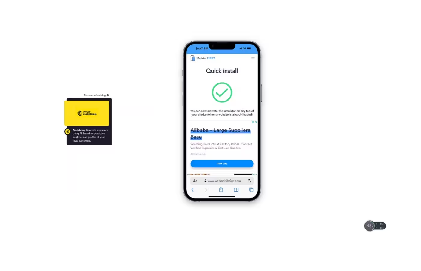
Smartphone and tablet simulator on computer with several models to test mobile responsive websites.
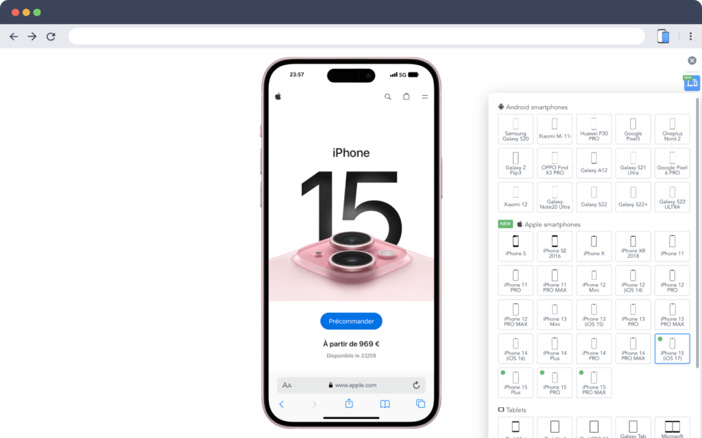
Very realistic desktop smartphone and tablet simulator with multiple devices and resolutions to test your mobile site.
You can basically simulate the mobile view of any website right within your Chrome browser. It’s super handy for making sure your website looks good on all screen sizes, especially if you want to create mockup with device frames. It gives a real feel for the design and helps visualizing the end result 📱
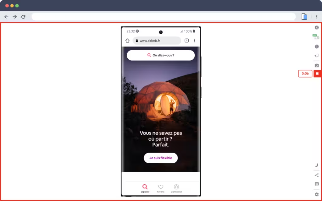
I know you are thinking “it’s just like Chrome dev tools”. But it actually does more than just simulate mobile views. It also allows you to take different types of screenshots easily and even record your “mobile” screen as a Webm. Plus a (improving) performance dashboard for a quick gland at your website’s metrics, and an upcoming (beta) builtin resizer to upscale the screenshot to higher resolution.
55 devices are available for responsive testing
📱19 recent and old Android & Google smartphone models including the Galaxy S22
📱23 recent and old Apple smartphone models including iPhone 15 (PRO & MAX)
💻 5 tablet models
⌚️ And 8 special devices such as the Apple Watch, a Self-Service Terminal or a Macbook
Some devices are only available in the premium version
Main characteristics
🎬 Very easily create video captures in WEBM, GIF or MP4 format.
📸 It is also possible to take a screenshot of the smartphone in transparent PNG to insert it in an email, presentation slides, etc.
🌚 Night mode available (see screenshots)
🏷 Non-intrusive advertising is displayed in the free version
This ad may be hidden in the premium version
Download Link : Chrome Extension


